Louise’s Soapbox: Understanding Web Psychology
If you can get to grips with the psychology of the online shopper and identify what pushes his or her buttons, you can design your website accordingly to guarantee success…
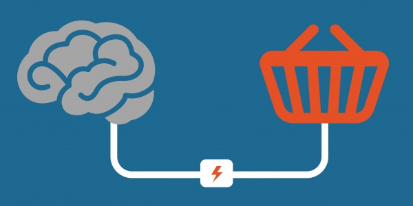
It’s been at least 30 years since marketers caught on to the idea that psychological elements factor in a purchase. Most rules that apply off-line also apply on-line including the element of psychology that triggers a purchase and if you can understand that psychology, you can then harness it and use it to improve your influence and sales.
The key to developing an understanding of the psychology of the online shopper is to first study and understand aspects of behaviour then you will be in a prime position to improve engagement with your visitors.
So what makes us navigate a website in the way that we do? We need to take a look at how the brain works to get an inkling of why we automatically click on certain links. The good news is that human brains are all essentially the same and so we process and respond to websites in very similar ways. For example, we all tend to read from top left to bottom right so design should place the most important content in exactly that order.
The most instinctive and basic part of the brain, the basal nuclei, is responsible for quick evaluations. It’s used when you first see a web page and so any site has to connect with the visitor at this point of quick fire decision – if a website can’t be understood at a basic level fairly immediately, it won’t be regarded as ‘easy to process’ by visitors and they may well leave.
Similarly, there is also a danger of ‘cognition overload’. If the brain has to work too hard to process information, we run the risk of losing the visitor as he or she, like the rest of us, is probably, essentially, quite lazy. Best way to avoid the ‘overload’ risk is to reduce clutter and categorise information for the visitor with devices such as mega menus to help provide a quick and easy path.
We all have similar expectations of what certain actions will result in and believe that others recognize these expectations and will meet them… So do it! Don’t try and trick the visitor into going down a route you want him or her to take – for example, checking boxes automatically that your visitors wouldn’t expect to be ticked. Deceiving visitors during the user journey is a likely way to disengage them and the disengaged lot is an even harder bunch to bring back!
When it comes to the familiarity and patterns of the shoppers’ on-line behaviour, social psychology is key as we look for group validation in order to make judgements. This is why links to reviews work well and social media, such as Facebook, can play a key role in an overall digital strategy. Ultimately, we will seek out reassurance that we are making the right choices and use them as a prompt to purchase.
Similarly, emotional triggers can be powerful tools to persuade users to act in the way you’d like. For example, the subtle use of fear is a common one used to create urgency. A key example is in the travel industry when booking sites inform us exactly how many rooms are left or how many people are watching and considering the flight prices, updating us on a fast declining availability.
Patterns also come into play as we humans are conditioned to recognize them and respond positively hence why standard web structure always works well: Logos top left of site; navigation bar at the top, beneath the menu; filter in the left-hand bar next to options….
Whilst the need to act as expected is key, you also need to delight and please customers in order to exceed expectations. These delights and pleasures can be something as simple as a discount code or an interesting download but they will arouse the human brain and offer a reward.
And talking of rewards, the best example of a fixed reward is providing visitors with the easiest path to their end point. Remember, the biggest obstacle to a conversion on a website is a difficult journey.
Finally, a quick mention for the use of colour on a website. Strongly believed to have varied meanings, colours offer a strong visual cue. Red is supposed to incite action, blue is trusted and calming. Oh, and wouldn’t you know it, pink is for girls. Thanks Sheila’s Wheels – we get it, honest!